参考:
The main idea behind the flex layout is to give the container the ability to alter its items' width/height (and order) to best fill the available space (mostly to accommodate to all kind of display devices and screen sizes).
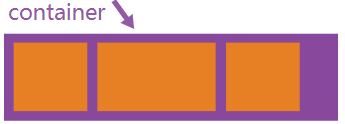
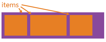
术语
table 中 '|' 会被当做党员分隔符,导致布局混乱,因而换做 '/'
 |
 |
|---|---|
| Properties for the Parent (flex cotainer) | Properties for the Children (flex items) |
| display : flex / inline-flex; | order : <integer> /*default value is 0*/ |
| flex-direction : row / column / row-reverse / column-reverse; | flex-grow : <number> /* default value is 0*/ |
| flex-wrap : nowrap / wrap / wrap-reverse; | flex-shrink : <number> /*default 1*/ |
| flex-flow : <'flex-direction'> // <'flex-wrap'> | flex-basis : <length> / auto; /*default auto*/ |
| justify-content : flex-start / flex-end / center / space-between / space-around / space-evenly; | flex : none / [ <'flex-grow'><'flex-shrink'><'flex-basis'> ] /*default value 0 1 auto*/ |
| align-items : flex-start / flex-end / flex / center / baseline / strech; | align-self : auto / flex-start / flex-end / center / baseline / strech; |
| align-content : flex-start / flex-end / center / strech / space-between / space-around; |
注意:
- flex 容器的align-content 属性,当(flex items)只有一行时,是无效果的;
- 对于flex items,float、clear、vertical-align 属性无效。
浏览器前缀
由于flex规范随着时间推移而发生了变化,因而(属性或属性值)需要添加浏览器厂商前缀才能兼容更多的浏览器。一下是通过sass 的@mixin 提供的解决方案
@mixin flexbox(){
    display:-webkit-box;
    display:-moz-box;
    display:-ms-flexbox;
    display:-webkit-flex;
    display:flex;
}

@mixin flex($values){
    -webkit-box-flex:$values;
    -moz-box-flex:$values;
    -webkit-flex:$values;
    -ms-flex:$values;
    flex:$values;
}

@mixin order($val){
    -webkit-box-ordinal-group:$val;
    -moz-box-ordinal-group:$val;
    -ms-flex-order:$val;
    -webkit-order:$val;
    order:$val;
}

/*eg*/
.wrapper{
    @include flebox();
}

.item{
    @include flex(1 200px);
    @include order(2);
}
应用(example)
http://fankeke007.github.io/css/common-layout-ways/flex.html